
Color Theory Week 4
Bringing It All Together: Creating Color Harmony in Watercolor
For our final painting, we’re bringing together many of the techniques we’ve practiced throughout the class! This lesson is all about taking what we’ve learned and using those skills together to create a painting that feels cohesive and balanced.
One of the things we’re focusing on is creating harmony through color. Sometimes choosing colors for a painting can feel a little overwhelming. There are so many beautiful colors to choose from, and it’s easy to get caught up trying to find the perfect combination.
One way to make this easier is to start with a simple color palette structure. Instead of choosing lots of different colors, we’ll give each color a little purpose.
For this painting, I used:
Dominant color: Burnt autumn orange
Supporting colors: Cerulean blue, deep evergreen, and golden amber
Accent color: Rusty red
Neutral: Warm taupe
The dominant color is the one that has the biggest presence in your painting. Supporting colors help build the rest of the scene, while accent colors add little pops of interest. A neutral helps balance everything out.
You don’t have to follow a strict formula, but thinking about colors this way can give you a helpful starting point!
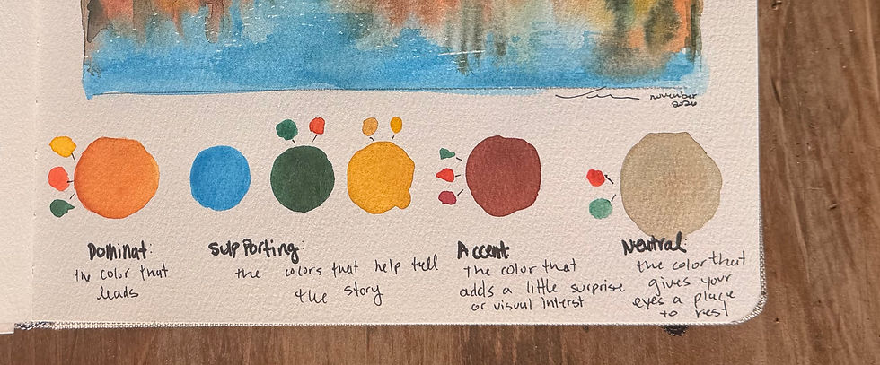
Mixing Our Color Palette
One of my favorite things about watercolor is discovering how many colors you can create using just the paints you already have. For this painting, I mixed everything from the colors on my existing palette.
Here are the combinations I used:
1. Burnt Autumn Orange – Our Dominant Color
Cadmium yellow
Cadmium light red
A small touch of brilliant green
I mixed the yellow and red to create a warm orange, then added just a tiny bit of green to soften and deepen it into a more muted, earthy autumn orange.
2. Cerulean Blue – Supporting Color
Pure cerulean blue
I used this color straight from the palette. It gives us a beautiful contrast against all the warm autumn colors.
3. Deep Evergreen – Supporting Color
Evergreen
A touch of cadmium red
Adding a little red helps deepen and mute the green, creating a richer, more natural evergreen shade.
4. Golden Amber – Supporting Color
Yellow ochre
A touch of cadmium yellow
The yellow brightens the ochre and gives us a lovely golden amber.
5. Rusty Red – Accent Color
Cadmium light red
Crimson red
A small touch of brilliant green
The combination creates a deeper, more muted red that works beautifully with our autumn palette.
6. Warm Taupe – Neutral
Cadmium light red
Brilliant green
By mixing these complementary colors together, we create a soft, warm neutral. You can adjust the balance depending on whether you want your neutral to lean a little warmer or cooler.
A Little Reminder About Color Mixing
Don’t worry about getting these combinations exactly right! Every watercolor palette is a little different, and the amount of water you use will also affect how your colors look.
Try mixing a little at a time, testing your colors on scrap paper, and adjusting until you find something you like.
Color theory doesn’t have to be complicated. Start by noticing which colors feel warm or cool, which colors complement each other, and how adding a little of one color can change another. The more you experiment, the more comfortable you’ll become.
Painting Process: Step by Step
Step 1: Start With the Sky
I began with cerulean blue and painted a graded wash in the sky. I started with a stronger concentration of color and gradually added more water to create a softer, lighter transition.
Remember, a graded wash is simply a way of transitioning one color from dark to light.
Step 2: Paint the Water
I carried that same blue into the water. I kept the color a little darker in the foreground and gradually lightened it as I moved toward the background.
This helps create a sense of depth and gives the water a little more dimension.
Step 3: Add the Reflections
While the water was still wet, I began adding the reflections of the trees. I chose to paint the reflections before painting the trees themselves because I wanted to take advantage of the wet-on-wet technique.
This allows the colors to spread and soften naturally, creating the loose, blended appearance of reflections in water.
Step 4: Build the Tree Canopy
Next, I moved up into the tree canopy. This was a chance to experiment with our different colors and really play with wet-on-wet painting.
Rather than focusing on painting individual leaves, I looked for larger shapes, areas of color, and places where the different colors could blend together.
Don’t be afraid to let your colors mingle! Sometimes the unexpected combinations create the most beautiful results.
Step 5: Use Lifting to Create Highlights
As I worked through the trees, I used a lifting technique to pull some of the paint back out of the paper.
This helped create lighter areas that suggest branches and little openings where light can come through.
Remember that lifting works best when you have a little control over how much water you’re using. You can use a clean, slightly damp brush to gently lift color from the paper.
Step 6: Add the Finishing Details
Once everything was dry, I added a few small details and highlights with a gel pen to help bring the painting together.
These little finishing touches aren’t always necessary, but they can be a fun way to add definition and draw attention to certain areas.

A Few Final Thoughts
As we wrap up this class, I hope you’re starting to see how all of these techniques can work together. Wet-on-wet, graded washes, layering, lifting, and color mixing aren’t just separate exercises. They’re all tools you can use together to create your own paintings.
I also hope color theory feels a little less intimidating. You don’t need to know every color theory rule or have a perfect understanding of the color wheel before you can create a beautiful painting. Start with a few colors you love, experiment with mixing them, and pay attention to how they work together.
One of the best ways to grow as a watercolor artist is simply to keep painting. Try different color combinations, make little swatches, revisit techniques we’ve practiced, and don’t be afraid to make mistakes along the way. Sometimes those unexpected moments teach us the most!
Thank you for being part of this class and for spending time painting and learning together. I hope you’ll continue exploring, experimenting, and finding joy in your watercolor journey.
Happy painting!


Comments